The Green Pheasant
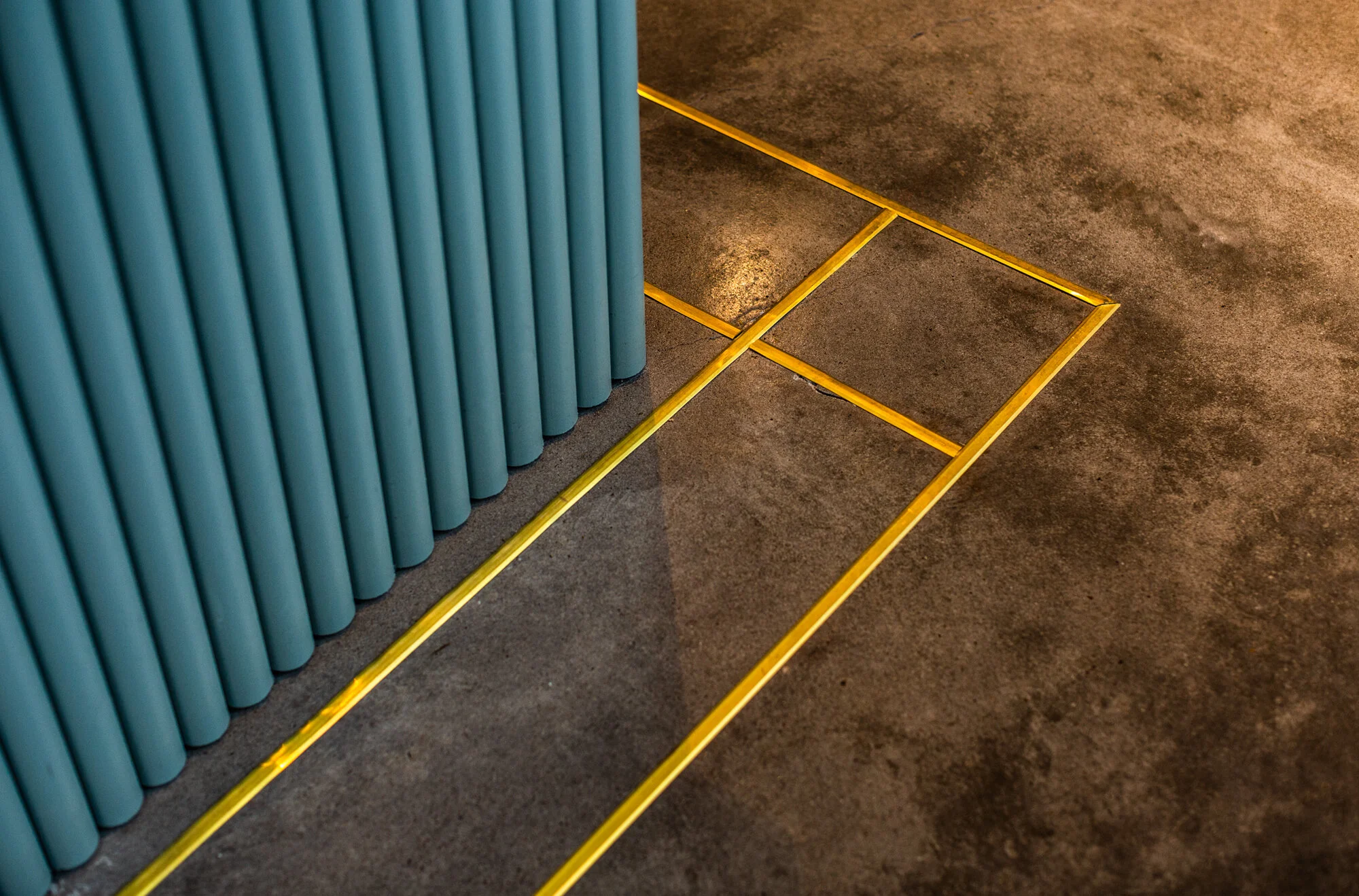
The Green Pheasant takes its name from the national bird of Japan, celebrated for its dramatic colors and unique mix of sensitivity and strength. In a sense, the chef-driven, Japanese-inspired restaurant’s design takes notes from the bird: an underlying inspiration of traditional Japanese minimalism is offset by deep wall paint and paper hues that create a moody intimacy, with furnishings that envelop guests in lush, jewel-toned velvet and chenille, and western architectural elements that add heft and brawn. Owners Seed Hospitality Group sought to embrace duality throughout the 7,400-square-foot space, blending the easy warmth of a neighborhood Izakaya with refined, fine-dining sensibilities — upscale, but not uppity. The design team achieved that aesthetic by playing with contrasts: slick black and white marble shines against a warm, end-grain bar top at the central, communal bar; energetic inlays of brass pop in the concrete floors; rough, hand-hewn Zellige tile anchors delicate pink mirrors at the back booths; and glamorous globe lighting blinks off a cheeky “Kitto Katsu” mirror and metal screens that playfully mimic the shape of unfolded paper cranes. To pair with the menu’s embrace of local ingredients, the design also placed an emphasis on local craftsmanship. Among the many custom touches: Nashville artists created and shared a burnished brass finish that flows from lighting and metalwork to artwork. That work — much like the overall design concept — brings disparate but complementary elements together, into a carefully (and locally) crafted whole.
TENANT BUILD OUT PROJECT
Featured In: Most Instgrammable Restaurant | Tennessee from Food Network Magazine
Nashville Eater’s 2019 Best Restaurant Design


